Q&A: Data Visualization Offers Rich Views
Layered data visualization includes a look at outliers.
- By Linda Briggs
- 04/14/2010
"The key to high-density visualizations … is that they can present both the overview and the detail simultaneously," says Andrew Cardno, CTO of BIS2. That allows users to understand both the overall patterns in the data and to see the outliers -- critical information in today's fast-moving world, Cardno maintains. His company, BIS2, offers software for analyzing massive data collections and producing visually centric results.
In this interview, Cardno talks with TDWI about the types of data visualization techniques and the rich insights into data that high-density, multi-layered visualization in particular offers.
BI This Week: What's happening in data visualization since we spoke last year? It seems to be an area of business intelligence that's moving very quickly. Is that what you're seeing?
Andrew Cardno: Data visualization is moving very quickly. There are a large number of data visualization players now that are very active. It's a competitive landscape, which shows how much interest there is in the space. It also shows you how difficult a subject it is to tackle. There are so many different approaches, from the very traditional graphs and charts to some very advanced visualizations. As you move through that spectrum, everyone is experimenting and working at new ways of looking at data.
What are some of those different approaches, especially as they relate back to business intelligence? Across the spectrum, what do you see from companies in terms of data visualization approaches?
There seem to be three categories of approach.
The first is traditional techniques such as the line graph. There have been enhancements, but we've essentially been using this approach for a long time -- but how do we best use [of line graphs], and what are the right kinds of approaches? Should we use 3D on a graph? How many lines can we add? Should we have graphs with axes on both sides? Pie graphs? In the end, there are players in that space who are working hard to say, "This is a more effective way of using traditional charting techniques."
The second group is exploring and working at unfolding -- something like a Rubik's Cube. They're taking Rubik's Cube and unfolding the dimensionality of the data. The data itself is used to represent the structure -- the important dimensions of the data. If you think about it in terms of database modeling, these are the dimensions or the axes of the data that are important in the data. How can I use those, unfold those, and show them in graphics?
The third approach is a multilayered, [structured] visualization. … The structure of the data is deterministic -- for example, a geospatial map, which is deterministic because people [indicated on the map] have locations. The deterministic structure then has layers of data added on top of it.
People are tackling all three of those approaches. If you look at data visualization companies, you can usually put them into one of those three categories. I don't think that any of them are right or wrong. They're just different; each has places where they can be applied effectively.
Regarding the multilayered visualization, the third approach you mentioned, can you give an example of how that might be used, again relating it back to business intelligence?
I'm going to give you two examples, one for context and the other to show you how [the technology] can be applied in a different space.
The first example is one that everyone is familiar with: cartography. You could create a "heat map" showing where each of your customers lives in North America. [The map would show] hot spots where customers are, and possibly the amount of revenue they're generating or some other measurement. That's the first layer -- an under-layer, if you like.
On top of that, you might add dots for the locations of your stores, along with dots representing where you want to put new stores, or dots representing some kind of statistical convergence, or places where your customers likely have met up. That's another layer.
Then you might add another layer of information -- for example, the weather, using numbers to represent the temperature. Finally, you might add a layer of information showing which roads people spend their time on when they're driving, and which freeways they use.
If you think about those different pieces of data -- the weather, the roads, the stores, and the customers -- they're not in the traditional sense related. You could say the customer is related to the store, but not really. It's just that a store is where it is and customer are where they are, but with two stores to choose from, there's no reason why a customer should go to one or the other.
These [types of maps] are excellent for independent data sets. Yet as I look at them, I can [also] understand the interrelationships between those four independent data sets. That's a multilayered visualization, and this technique has been used for years and years in mapping. It's a very well-established technique.
If you simply look at the problem -- how can I look at very different data and understand how it relates -- within a database, you will try to figure out how to do complex joins or relationships with other databases. I don't need to do that -- the map gives me a very good understanding.
Moving beyond mapping, what's the second example you mentioned?
The second example is what I call a temporal visualization. In this, we represent time by spiral. Spirals, I think, are very good ways of representing time-based events because they show you the frequency of data…
A professional retailer might say, "Over a period of time, I know when I sold things, but I also ran a broad-based marketing program -- TV, magazines, Web ads." So what worked? If the retailer knows when [the ads ran,] that can be incorporated as a layer.
Atop that layer, I can put another layer saying, "Here are events that happened at a point in time" -- since time is the structure we're dealing with here. We're using the cyclical nature of time to build a structure which is deterministic in nature -- so there's really only one way of showing it.
We can overlay other layers of information also. Weeks later, the retailer might add marketing programs, and then on top of that external holidays, events, major political campaigns, elections, and so forth.
I've seen beautiful visualizations using temporal analysis to look at events like the Winter Olympics. … Within the structure of time, you can build up layers, keeping going as you think up other time-based information and layer it in.
The "temporal spiral" in Figure 1 illustrates comparative DVD rental sales over a seven-year period. The data visualization, produced by BIS², depicts a calendar as a temporal spiral comparing DVD rental revenue over a seven-year period. Reds (hot colors) indicate periods of high sales, greens indicate periods of average sales, and the blues (cool colors) indicate periods of low sales. The intensity of the colors shows the relative values. The small black dots are the beginnings of weeks starting with 2001, spiraling out clockwise from the center. The graduated red dots are the significant movie releases. The size of each dot indicates the significance of the event.
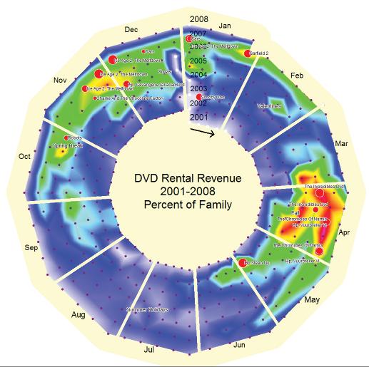
Figure 1
That's a second example of layered visualizations.
Using these techniques, people can see relationships among different data points that they might not have seen before?
The key to high-density visualizations, in fact to any visualization, is that they can present both the overview and the detail simultaneously. … Someone can both understand the overall patterns and see the outliers. If you think about other methods of visualization, which might be to average the data down, or to show much less density or information, those approaches tend to hide the outliers.
Are you saying that hiding or overlooking data outliers is a bad idea?
In today's world, it's just plain wrong. You can't do it -- we live in such a dynamic environment. You need to be looking for when the data doesn't match the pattern we're expecting. The way that we were aggregating data is simply no longer useful.
For example, a map might show areas where purchasing behavior has changed. I might suggest that Manhattan has changed its purchasing behavior dramatically in the last three months. I've been doing analyses with maps and seeing quite remarkable trends that I did not expect to see. That's always a kind of a test. Why is it that customers here are increasing and customers here are decreasing? Why is that happening? What is it about where they live that's driving their behavioral pattern in terms of when they give me their business? To do that, you have to be able to see both the overview and the detail simultaneously.
It's the same kind of thing on a temporal visualization. People are saying, "I really want to understand if these external events are driving changes in patterns." I can't anticipate the right questions to ask, but by overlaying the different data sets and letting people see the whole and the detail simultaneously, you're able to get aspects of the data at a glance that you've never seen.
Where do you see data visualization headed in the next few years?
It's becoming mainstream -- I'm seeing this everywhere I go. With few exceptions, organizations are … pushing to see opportunities that they wouldn't otherwise have seen. You can't do that with simple data analysis. The companies that are winning are the ones that are really applying themselves to finding the exceptions and the anomalies in the data. …
Companies that understand the value of data are going to be the winners -- that's what we're looking at in today's world. We're seeing companies that were the benchmarks of industry disappear in the space of a couple of years. We're seeing General Motors go in from the biggest car company in the world to nothing. We're seeing Toyota [in trouble]. We're seeing these huge, huge changes in a very, very short [period] of time. In that kind of extraordinarily dynamic environment, what I'm seeing is that some companies -- not all companies -- are saying, "This day will pass. I see a more positive future, and I need to embrace the change and understanding." Companies that don't enable themselves to do that may not be here in five years.
The companies that are going to survive and do well are either going to be very lucky or will work really hard at it and see opportunity and change. The question is, do you want to rely on luck or talent?